
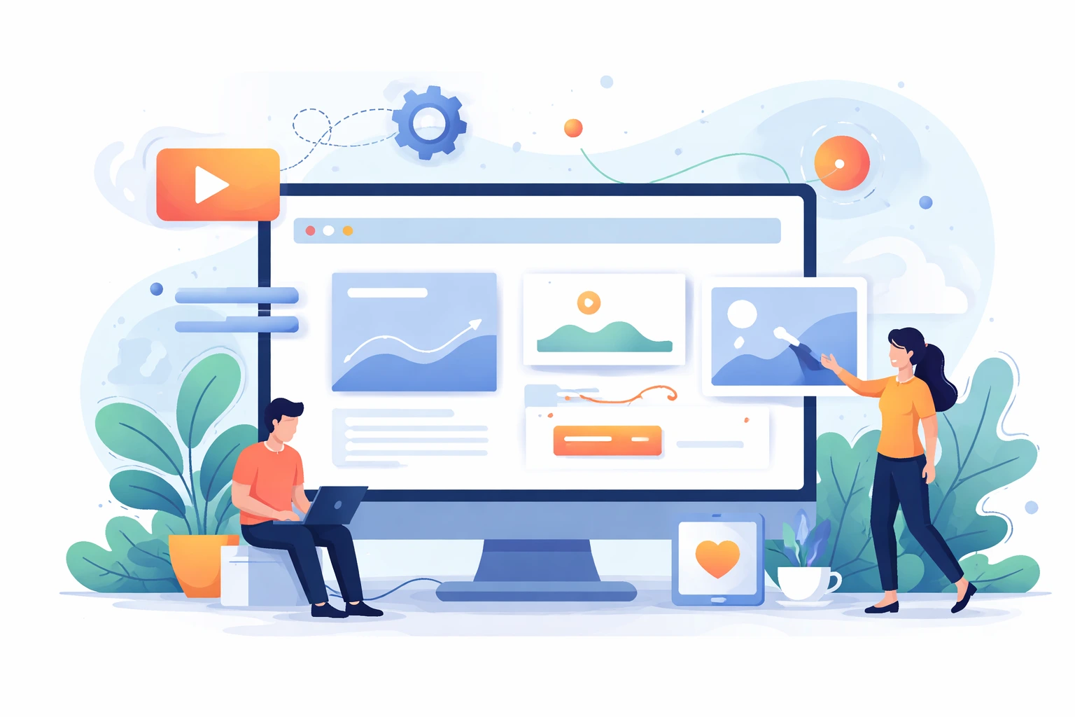
Developers can start designing motion-first interfaces by treating animation and transitions as foundational elements rather than afterthoughts.
This approach puts movement at the center of the user experience from the first moment. You consider how elements enter, exit, and change as you design each component, which transforms the way the interface comes together.
In this guide, we’ll explore practical techniques for integrating motion into your development workflow. You’ll learn how to choose the right animation libraries and establish motion design systems that scale across your applications.
First, we’ll look at why motion design is essential for developers today.
Motion design directly improves user engagement and retention by making interfaces feel more intuitive and responsive, which translates to better product metrics and happier users. Basically, motion gives you a way to communicate system states and guide attention without cluttering your interface with extra labels or instructions. Here’s how:
This shift toward motion-first thinking will happen gradually. But once you start noticing how animation shapes user behavior, you’ll find opportunities everywhere in your work.
Successful motion design relies on understanding how users perceive and process movement. Let’s break down the two foundational concepts that influence every animation decision you’ll make.
Timing refers to the duration of an animation, while easing functions control the rate of change during that animation(determining whether movement feels natural or mechanical).
Think about how a drawer slides open: it accelerates at first, then gradually decelerates as it reaches the end. That’s easing in action, and when you replicate this pattern digitally, interfaces immediately feel more intuitive and less robotic to users.
The difference between good and great motion design often depends on how clearly state changes show what just happened and what comes next. Any clear motion will help your users understand the system without thinking too hard.
From our experience, this clarity is what makes an interface feel professional. For example, if a button turns into a loading spinner and then a checkmark, each step confirms the action worked without extra messages.
Building your motion design toolkit means choosing practical tools that help you create motion-first interfaces efficiently. Once you find the right toolkit, it will make your motion design into something approachable and efficient. Here’s what you need to get started.
CSS animations are often the fastest and easiest way to add motion to an interface. They require little code and run smoothly in all modern browsers. For simple effects like hover states, button feedback, and basic entrances, CSS transitions do the work without extra JavaScript.
You can build a sliding navigation menu with just a few lines of CSS using the transform property and transition timing. Then the browser will handle performance automatically across devices.
JavaScript animation libraries are specialized tools that provide advanced control over complex animations. It also offers features like timeline management, physics-based motion, and precise sequencing that CSS alone cannot handle.
Based on our experience, they’re essential once you move beyond basic transitions. We recommend tools like GSAP for multi-step animations where elements move together or respond to scrolling. Yes, the added control comes with a learning curve, but the capabilities unlock motion patterns that would be nearly impossible to build with CSS alone.
Have you ever noticed how certain interactions feel instantly familiar across different apps and websites? Modals often fade in with a slight scale effect, loading states pulse gently, and cards lift on hover to show they are clickable. These patterns feel natural because designers and developers have settled on motion styles that work well for users.
As mentioned earlier, clear state changes give users instant feedback. Likewise, when familiar motion patterns are used, users understand the meaning before they stop to think about it. For example, a notification panel that slides in on a dashboard feels natural since users have seen the same motion in email apps and social feeds.
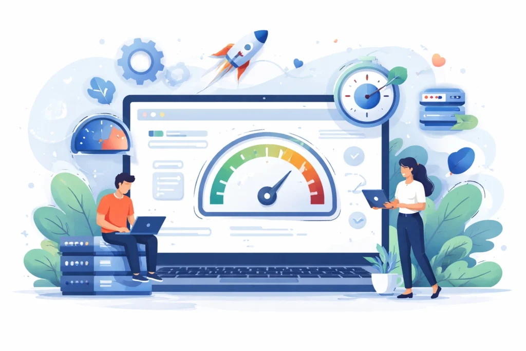
Optimizing your animations helps them run smoothly at 60 frames per second, avoiding janky experiences that frustrate users and damage your product’s credibility. We all know that beautiful animation won’t mean much if it stutters or lags.
So these are what you need to watch for when implementing motion:
Animating properties like transform (for position, scale, and rotation) and opacity keeps your animations running on the GPU. This handles these calculations far more efficiently than the CPU manages layout-heavy properties. On the other hand, animating layout-heavy properties like width, height, or margin forces the browser to recalculate many elements each frame, which can create visible lag.
That smooth animation on your development machine might crawl on a three-year-old smartphone. So grab an older device and test there before shipping.
We’ve seen many well-designed interfaces fail because their animations struggle on lower-end devices. This frustrates users, and makes the product feel slow and unresponsive.
Tools like Chrome DevTools let you see how your animations perform in real time. They show where frames drop, and help you find and fix performance issues. This way, you can monitor during development to make sure animations run smoothly on different devices and provide a better experience for users.
You might be thinking that working with design teams should be straightforward, but collaboration around motion specifications is notoriously difficult.
The problem usually shows up in handoff documents that describe animations vaguely, like “smooth transition” or “feels natural.” It leaves you guessing about actual timing values and easing curves while designers wonder why the implementation doesn’t match their vision.
So establish a shared language early by building a motion design system that defines duration ranges and easing presets for both teams to use. For example, when designers say “standard entry animation,” most people know it means 300ms with ease-out timing. This removes uncertainty, shortens timelines, and reduces frustration during collaboration.
So, what did you think of this approach to building motion into your development process?
Instead of adding motion later, you design each feature or interface element with movement in mind. This mindset is what separates developers who create good interfaces from those who build exceptional ones.
Consider how Duolingo designed motion into their lessons from the start. Each completed exercise triggers a satisfying animation that highlights progress and keeps users engaged during longer study sessions.
Interfaces designed with motion-first thinking feel more responsive and intuitive, reducing friction and making your product memorable. Starting with motion also saves time, preventing rework and inconsistent animations later.
So, ready to transform how you build interfaces? Movea Tech provides the tools and resources developers need to implement motion-first thinking efficiently across their projects.