

Natural interaction is becoming the next competitive advantage because it makes technology easier and more intuitive to use. In fact, better UX design can push conversion rates up by 400%, according to research from Forrester.
Companies that invest in natural interaction watch their user satisfaction climb because people can finally accomplish tasks without wrestling with the interface. When you strip away the parts that slow people down, they hang around longer and come back more often.
In this article, you’ll learn three specific ways to find opportunities hiding in your current design. We’ll also walk through how gesture control changes what users expect, where to look in your user behavior analytics tools, and which types of helpful content build customer loyalty.
So, let’s find out how natural interaction can give you advantages.
Natural interaction is how users engage with your product without thinking about the mechanics behind it. For example, someone swipes to delete an email or pinches to zoom on a photo. These movements feel obvious because they mirror what people do in the physical world.
Here’s what that looks like in practice.
Gesture-based interfaces let users interact with screens using hand movements they’re already familiar with. Users learn how to use them quickly with little to no learning curve because these controls feel intuitive.
For instance, motion-sensing technology detects body movements and responds instantly. So when someone waves to navigate a menu, they don’t have to think about pressing buttons or translating their intentions into clicks.

Traditional user interfaces create friction by forcing users to convert their intentions into clicks and navigate through menus. This is something that becomes more frustrating as wait times increase.
Each extra step raises the likelihood that users will give up or become annoyed. Additionally, complex hierarchies often bury features that should be easily accessible, which makes the experience even more difficult.
Through our work with motion-tracking interfaces, we’ve found that users often abandon your product right before completing a key action.
But the solution comes with the problem. There are tools to show you exactly where people get stuck. You just need to know which metrics are important and what they’re telling you about user behavior analytics.
Take a look at these metrics:
Once you know where the problems hide, you can prioritize fixes based on how many users they affect. And if you combine these user behavior analytics tools with real user feedback, you’ll also understand what’s important to your target audience.
Usability testing gives you direct insight into how people experience your interface before problems cost you customers. With this approach, you clearly understand what works and what doesn’t.
Here’s the part most teams skip: they only test their designs with colleagues or friends instead of real users who match their customer base. In reality, testing with diverse user groups exposes how people think or what they expect from similar products.
Plus, direct observation is better than surveys because you see what users do instead of what they say they do. Let’s say someone might tell you a checkout process feels simple in a survey, but then you watch them click back and forth five times trying to find the payment button.
That gap between what people report and what they actually do reveals where your UI design needs work.
Fun Fact: Testing with 5 users uncovers 85% of usability problems in a design. For your reference, the typical value shows that 31% of usability problems are discovered while testing a single user.
Your UI design meets user expectations when people accomplish goals without confusion or extra steps. But the problem is that most teams miss the boat on this because they design for how they think users should behave instead of how users actually behave.
These are some ways of matching your UI design to your user expectations.
Users don’t read instructions or watch tutorials before diving into your product. Rather, they expect things to work based on patterns they’ve learned from other apps and websites.
So start with the most common user paths to make sure your core features work smoothly. These are the actions that take place hundreds of times each day. So we suggest checking completion rates for the main actions to see where people struggle or drop off entirely.
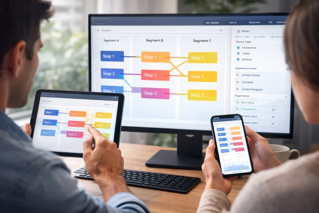
In fact, most product teams already know where the complaints are piling up. To fix those, compare how different user segments navigate. You’ll spot patterns you might have missed based on device type, location, or experience level.
Quantitative data reveals what users are doing, while qualitative feedback shows the reasons behind those actions. And combining both is essential for making informed decisions about which issues to prioritize.
We recommend starting by setting up event tracking on the interactions that are most relevant to your business goals and user experience. You should also pay close attention to any gaps between your intended design and how users actually engage with your product.
The best part about helpful content is that it solves problems before users get frustrated enough to leave. On top of that, they also start trusting your product to guide them.
However, a mistake most companies make is dumping all their help documentation into a single FAQ page and wondering why nobody reads it. But they don’t realize that users don’t want to hunt through walls of text when they’re stuck on a simple task.
Here’s how you can increase customer loyalty correctly:
When you provide helpful content at the right moment, users remember that experience. They come back to that comfort more often and recommend your product because you made them feel capable instead of confused.
Fun Fact: Statistics from Harvard Business Review shows that increasing customer retention rates by just 5% can boost profits by 25% to 95%.

Once you understand what drives user behavior, you can pinpoint where your design falls short. If you want to know the fastest way to find what’s broken, you need to identify friction points that users don’t always mention.
Here are three proven methods to uncover design issues.
Pro Tip: Begin with journey mapping to find problem areas, check how competitors solved similar issues, then test your fixes on a small group first.
Natural interaction gives you an edge by making your product easier and more enjoyable to use. When people can accomplish what they need without thinking about how your interface works, they remember the experience and tell others about it.
That’s why you start with one area where users struggle most. Then test your improvements on a small group, and roll changes out based on what the data tells you. Your target audience will notice the difference better than you think.
At Movea Tech, we specialize in motion-control technology that powers these interactions. Visit us if you need help with finding out what users want and what current interfaces provide.